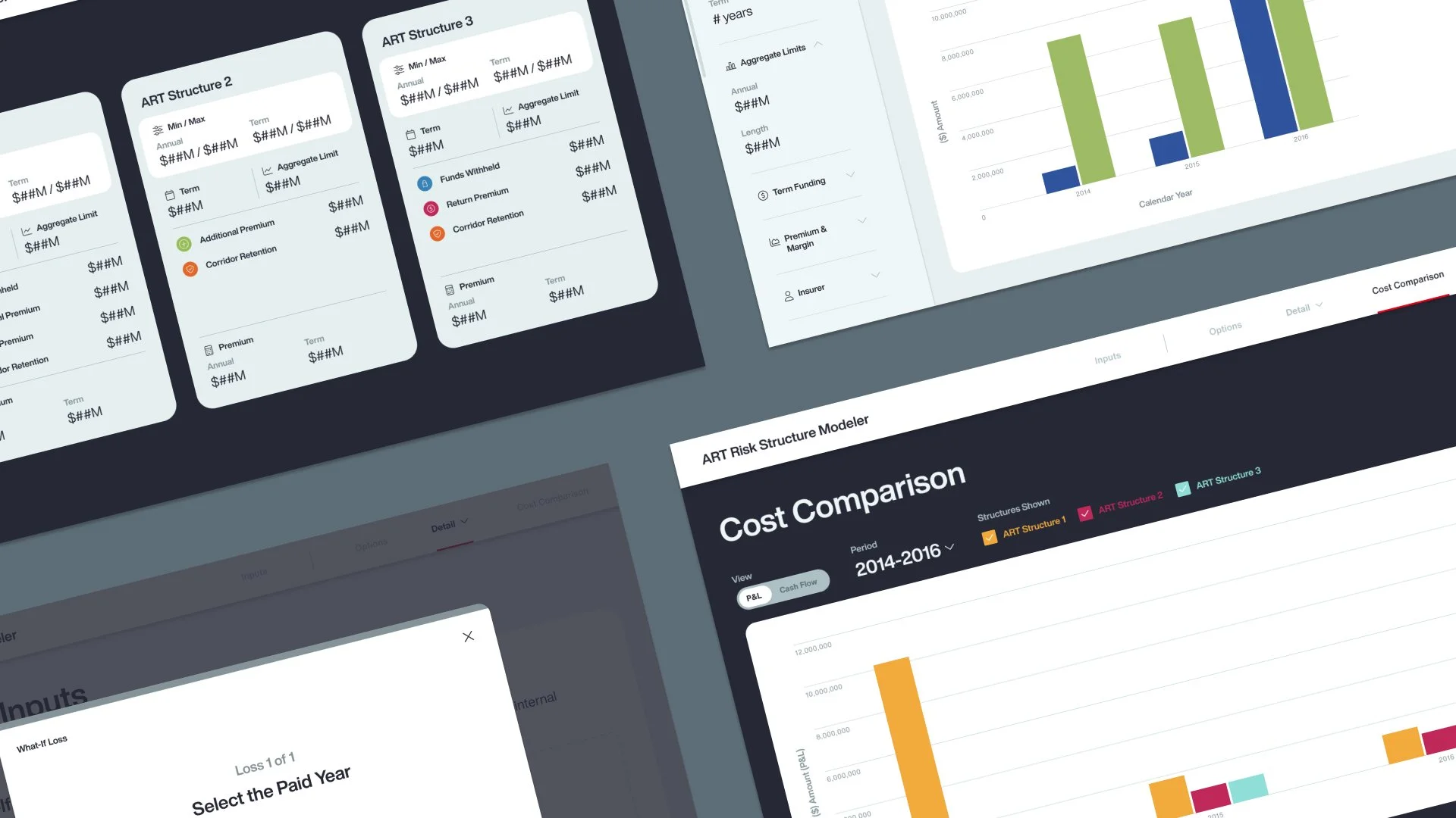
Enabling Aon’s Advisors to Model Complex Risk Structures in Real Time
TIMELINE
4 months, Ongoing
TEAM
2 Product Owners
1 Developer
TOOLS
Figma
Google Analytics
ROLE
Design Lead
This year at Aon, I led end‑to‑end product design for the Alternative Risk Transfer (ART) Calculator, a net‑new tool built from scratch to replace dense Excel models in high‑stakes RFP and pitch meetings. Working through ambiguity with Aon’s ART Team, I learned their domain, simplified complex risk calculations into clearer flows and visualizations, and shaped an MVP that lets teams explore “what‑if” scenarios live while telling a focused, data‑backed story.
01. PROBLEM SPACE
WHAT IS THE ALTERNATIVE RISK TRANSFER CALCULATOR?
The Alternative Risk Transfer (ART) Calculator is a greenfield, interactive risk calculator used in live proposal and pitch meetings during the RFP/bid process that lets Aon advisors model and visualize Alternative Risk Transfer scenarios in a polished, reusable digital experience.
WHY IT’S BEING CREATED
Previously, ART advisors relied on dense Excel workbooks shared live in meetings or commissioned bespoke, one-off microsites to model scenarios for each opportunity. The calculator replaces these ad‑hoc solutions with a scalable, on-brand tool that makes complex risk analysis easier to explain, faster to run, and more effective in high‑stakes client conversations.
PRODUCT GOALS
Deliver a turnkey, reusable presentation experience so teams don’t have to rebuild decks and models for every client.
Turn complex risk calculations into clear, credible stories that help Aon teams win business by demonstrating insight and value.
Support live, “what‑if” exploration in meetings so advisors can manipulate data in real time and adapt the narrative to each client’s questions.
03. SOLUTION OVERVIEW
01
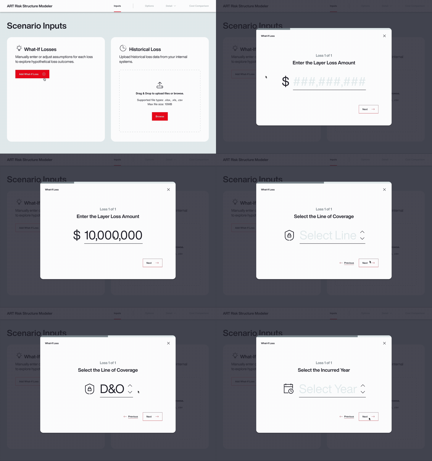
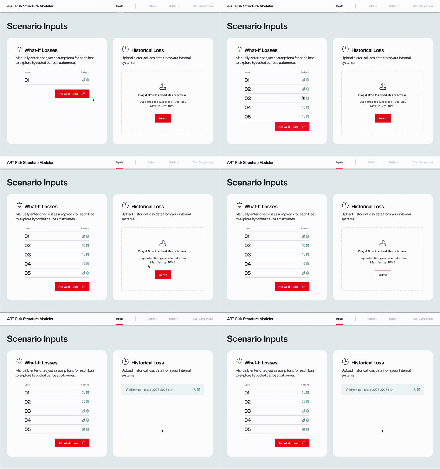
Easily and intuitively collect custom client data and configure what‑if loss scenarios through a guided input flow that feeds directly into the live analysis.
02
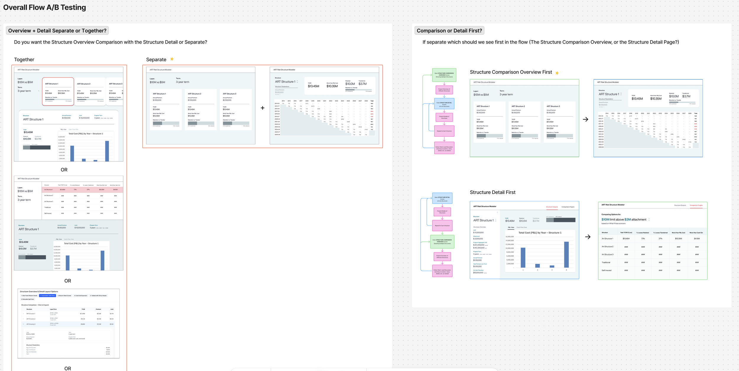
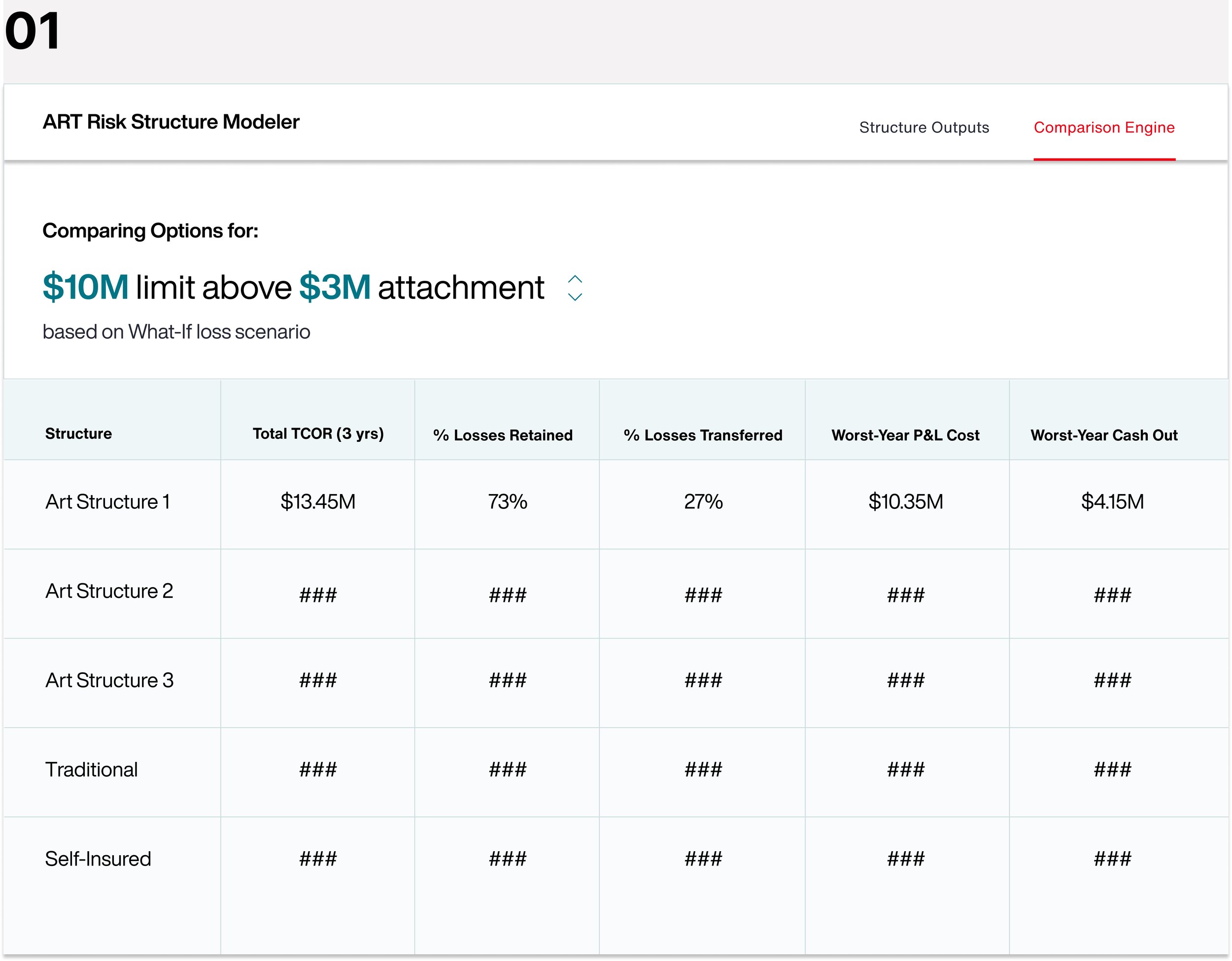
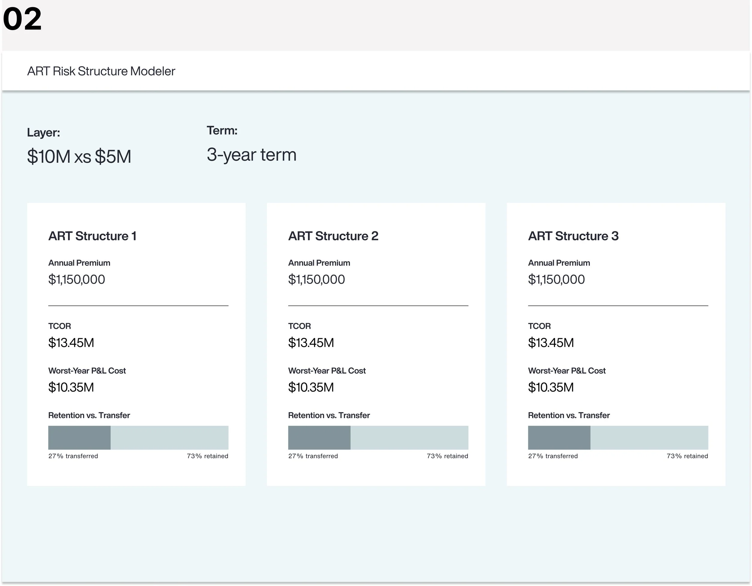
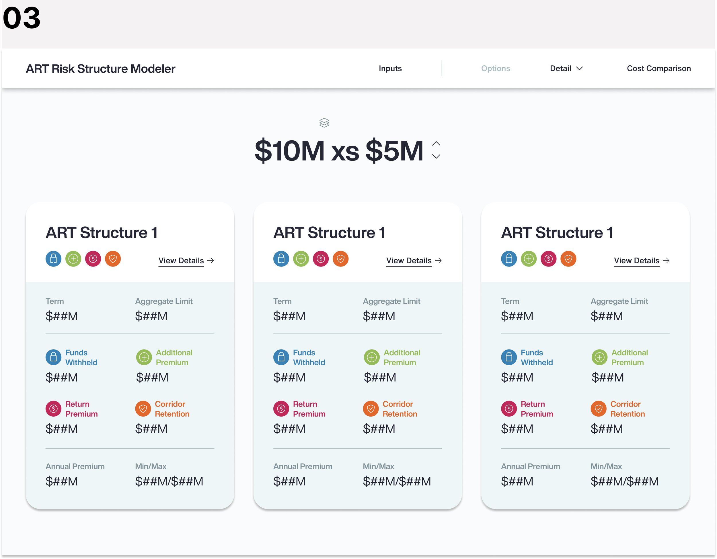
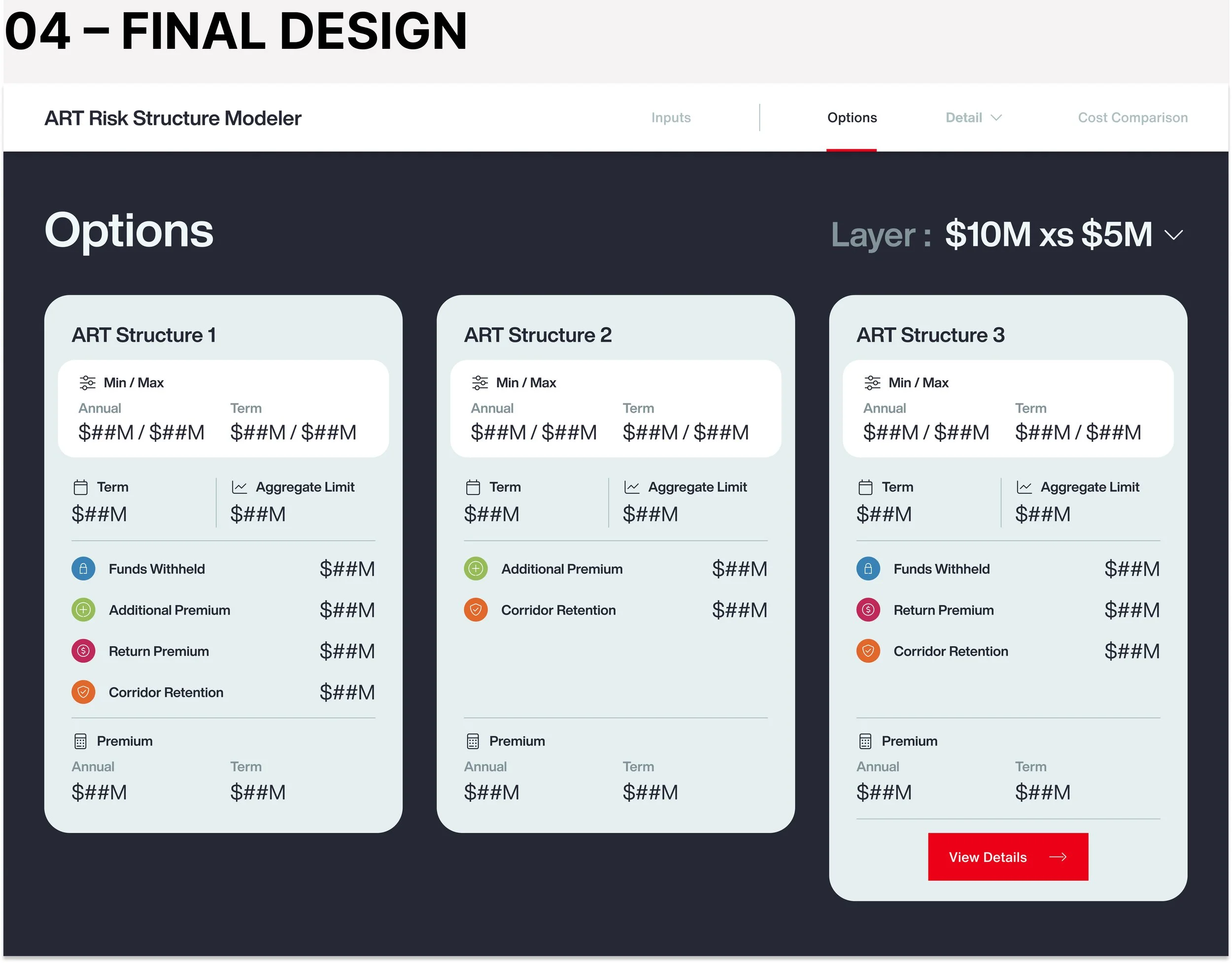
Surface and compare multiple ART structures side‑by‑side in a single view so advisors can quickly frame options for the client.
02
Dive into a single structure’s detailed outputs to explain how different loss scenarios drive projected losses and costs.
04
Visualize side‑by‑side
cost comparisons to tell a clear value story and support a data‑backed recommendation.
FULL PROTOTYPE VIDEO
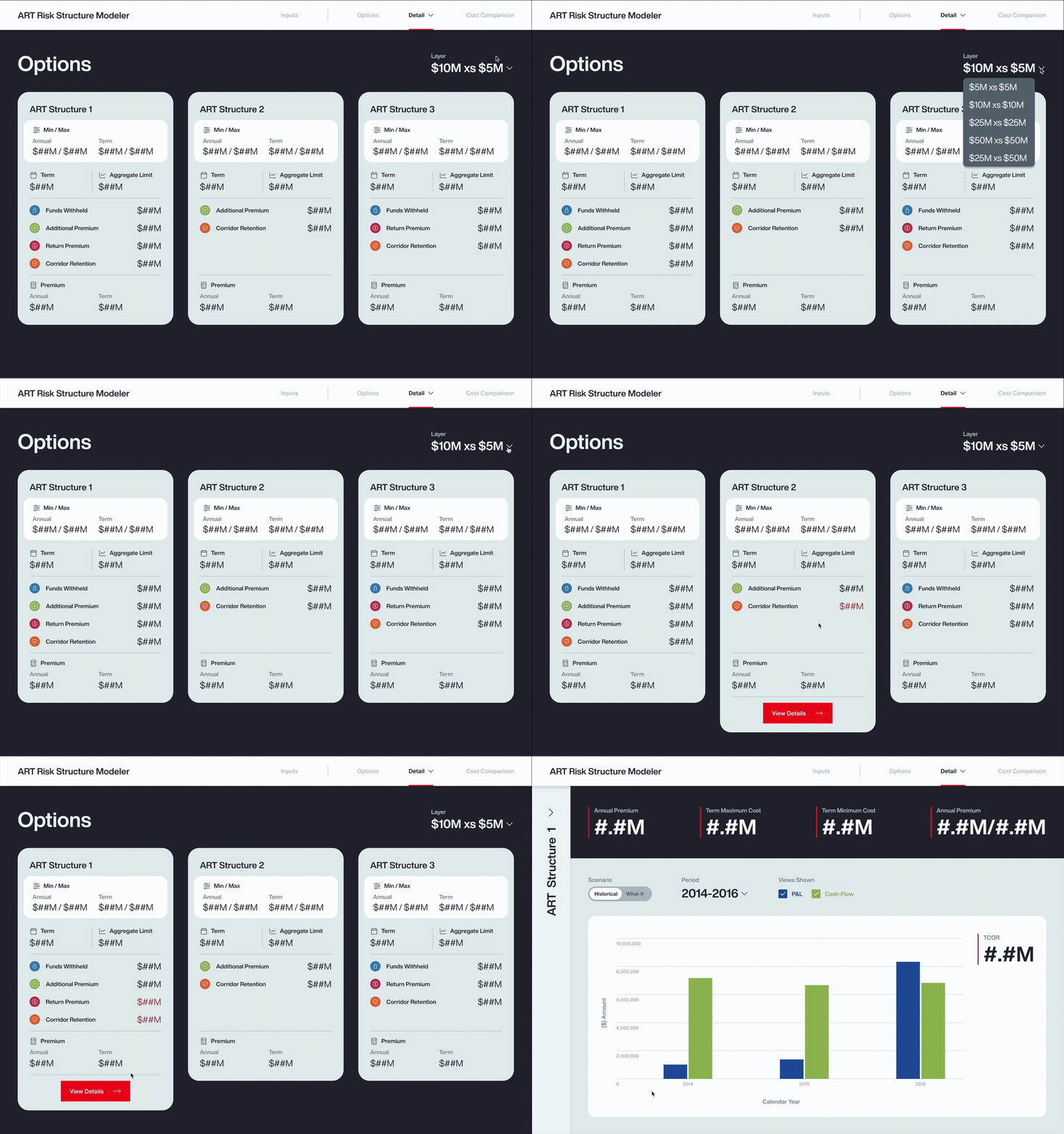
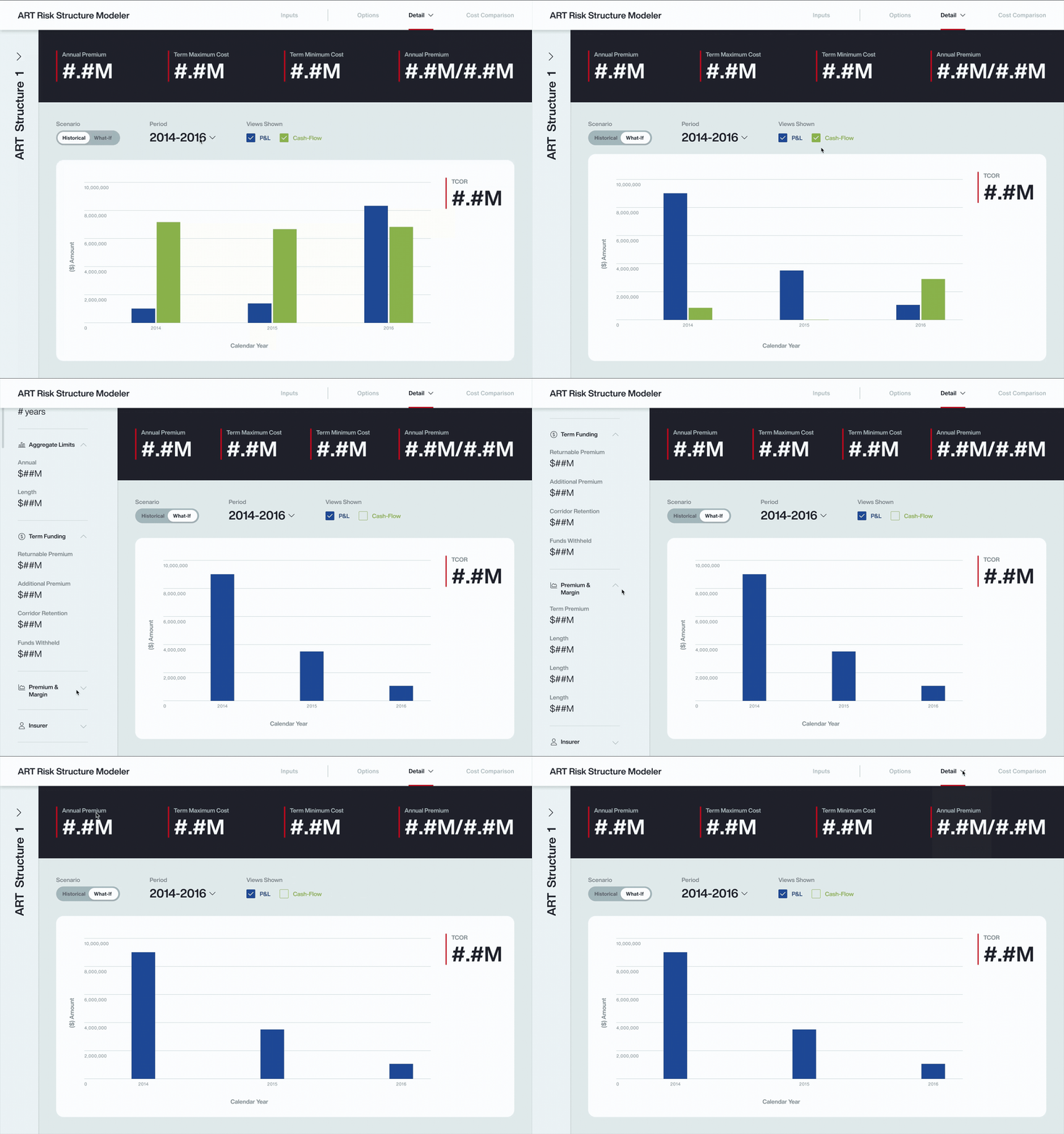
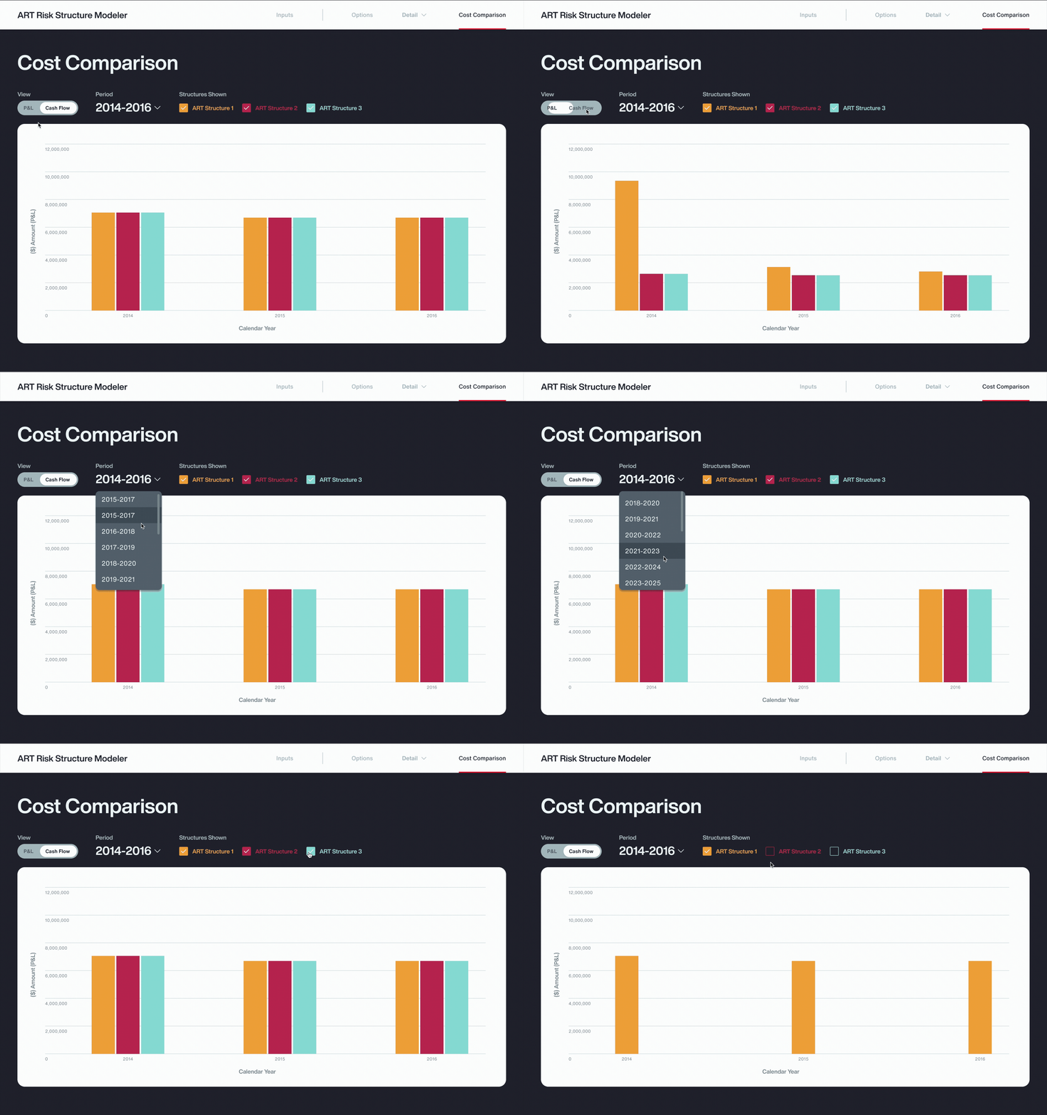
03. PROCESS
[SECTION CURRENTLY IN PROGRESS]

01 USER RESEARCH
Since this was a net‑new product, the project kicked off with a conversation between me, the developer, and two ART advisors sponsoring the tool. They shared early ideas, and briefly how they were currently presenting ART risk calculations in client meetings and their main pain points with the existing model.
Starting from just that discussion and a few spreadsheets was overwhelming. I didn’t yet understand many of the ART concepts or what actually happened in live client conversations, and there was nothing tangible to react to. To build enough domain knowledge and define the problem space, goals, and success metrics, I developed an “ART data cheat sheet,” ran contextual inquiry and card sort sessions, and conducted precedent research.
To synthesize and articulate my initial research, I created user personas, mapped the end‑to‑end user journey with a task analysis, and ran an affinity mapping exercise to cluster insights and define clear product and user goals.
Coming Soon…
ART DOMAIN RESEARCH
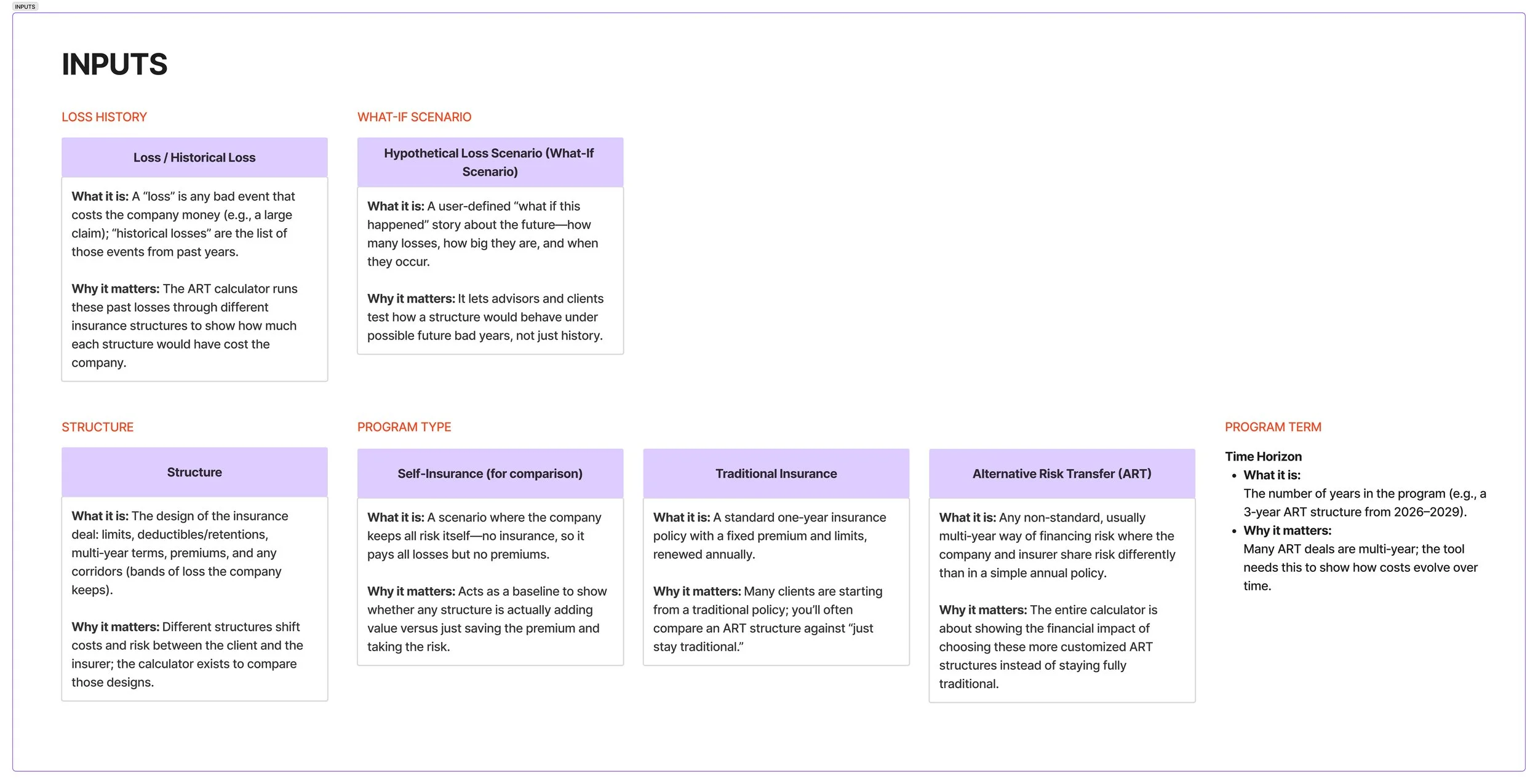
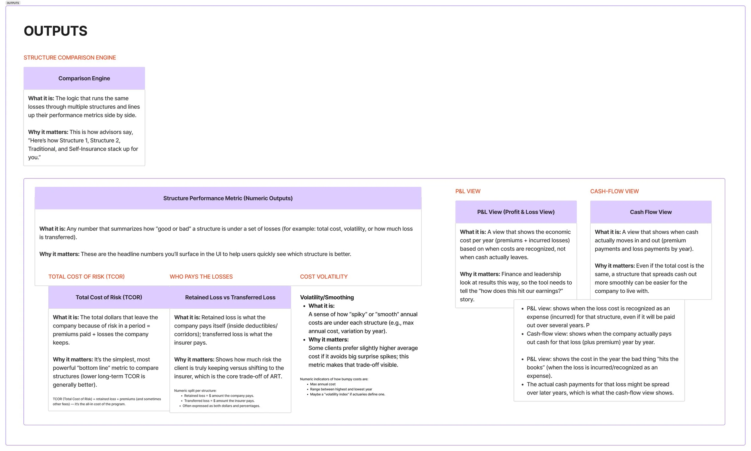
I first created a “data cheat sheet” to unpack and organize key ART concepts and data.
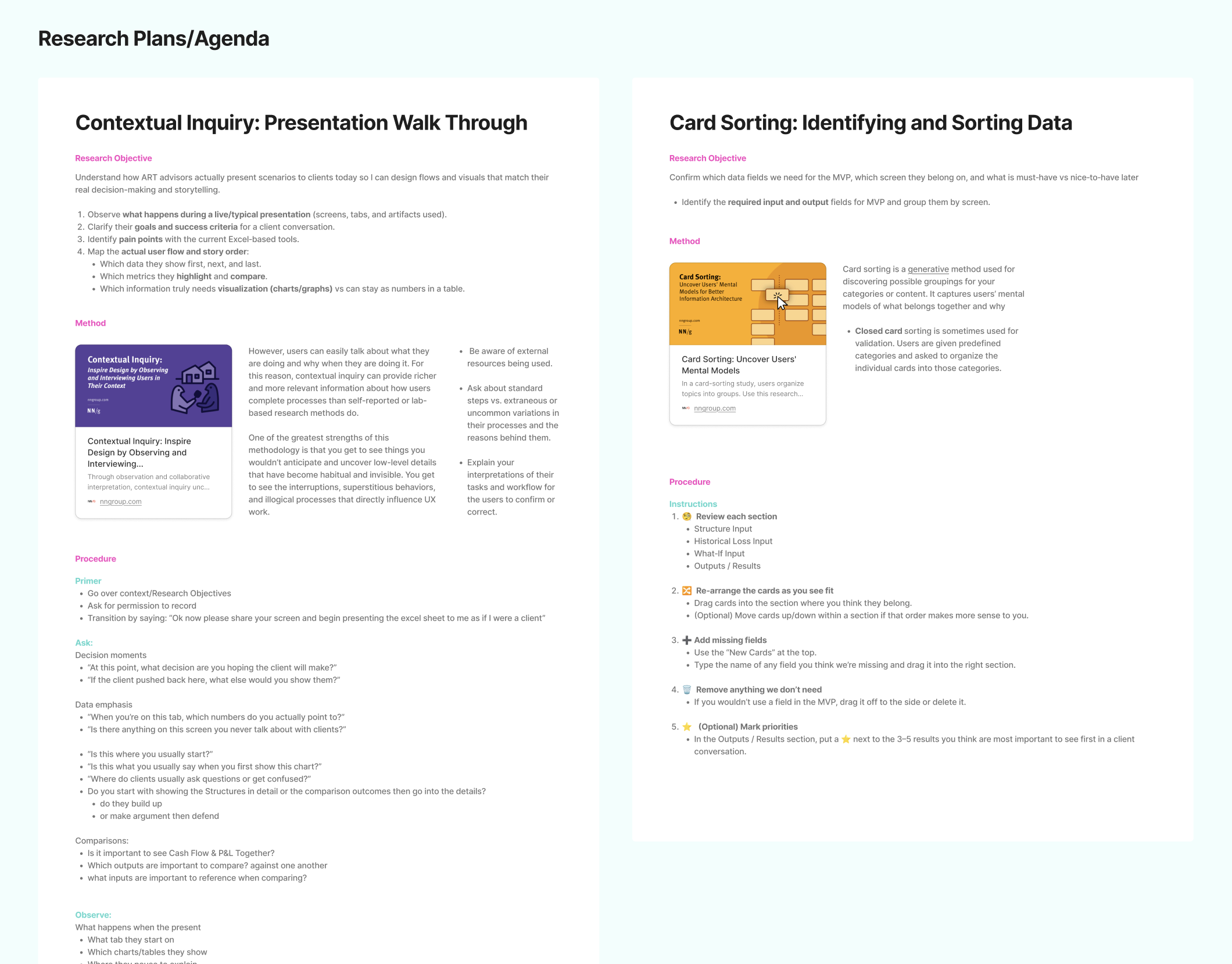
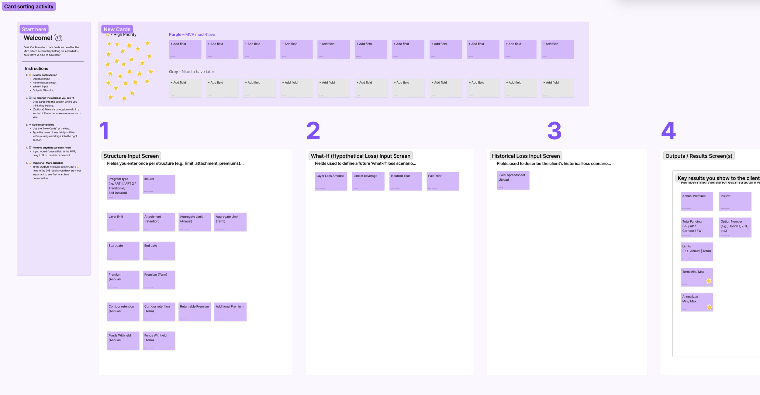
I ran a contextual inquiry session to observe how advisors currently prepared for and ran these client meetings with their current calculation tools. Then, I facilitated a card sort activity with them to understand how they grouped and prioritized all the ART Calculator data.
USER RESEARCH
PERSONAS
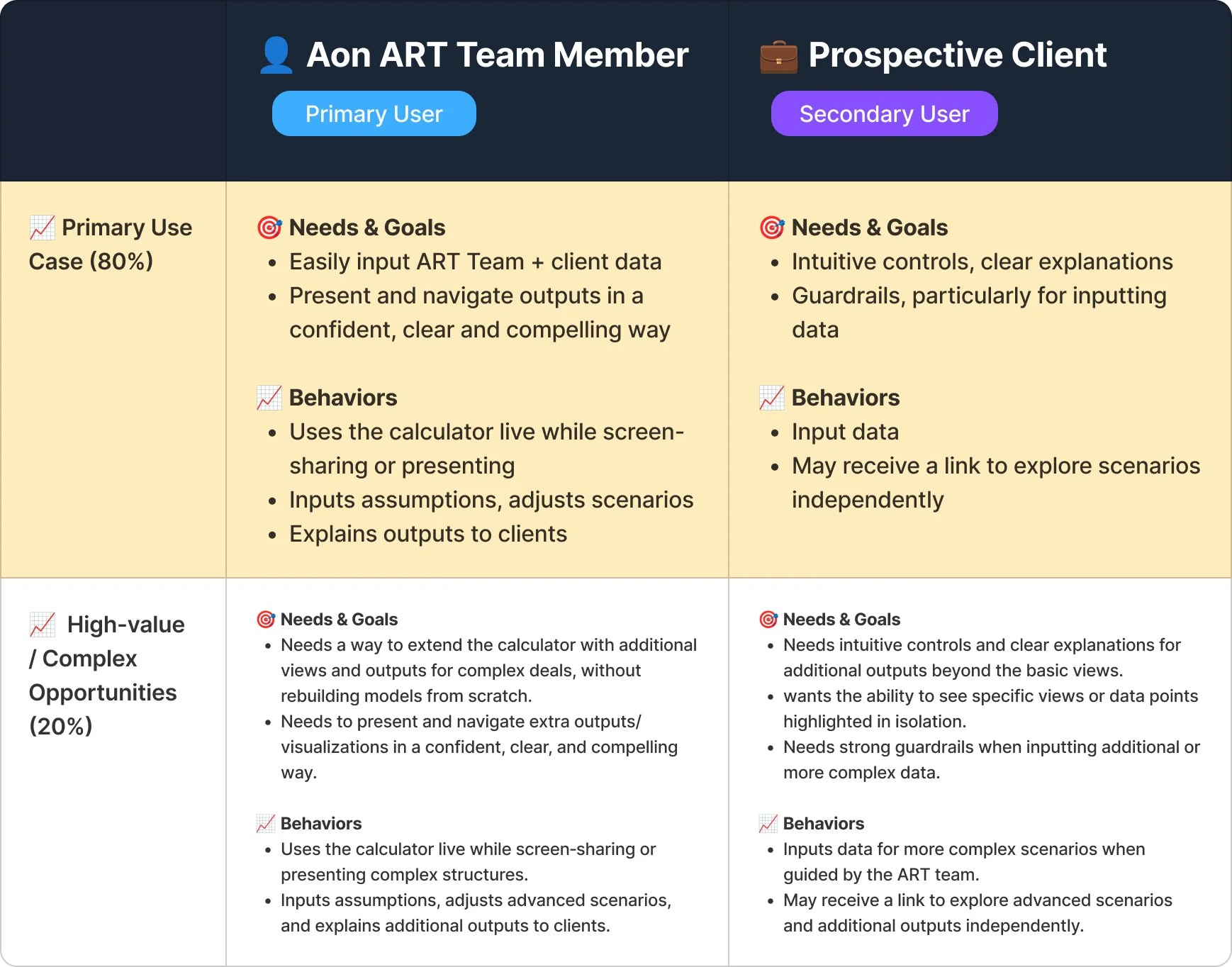
I identified two user groups: Aon ART team members as the primary users, who need a fast, confident way to drive the tool during live presentations and use it to tell a clear, data‑backed story; and prospective clients as the secondary users, who contribute their loss‑scenario inputs and are the key audience interpreting the outputs. They need intuitive controls and clear visuals to quickly understand and trust the recommendation.
For this MVP, we focused on the primary 80% use case where both users follow a standardized set of inputs, outputs, and views, while documenting secondary, future‑state use cases for more complex opportunities, where the tool will require additional inputs, outputs, and visualizations beyond the standard pattern, and ultimately be handed off for clients to explore independently after the presentation.
USER JOURNEY + TASK ANALYSIS
Using Insights from the contextual inquiry exercise I mapped out the end-to-end user journey. When I first created this journey map, not all boxes were filled it. I use this to track what information was missing/where I needed to do more research. This also helping me understand what user actions happened behind the scenes/in front of the client, and helped me group actions involved with caculator inputs and outputs + also mark which part of the user journey we were focusing on for the MVP and documented ideas for future states.
User Flow
Information Architecture
SYNTHESIZING KEY RESEARCH FINDINGS
OPTIONS PAGE ITERATIONS
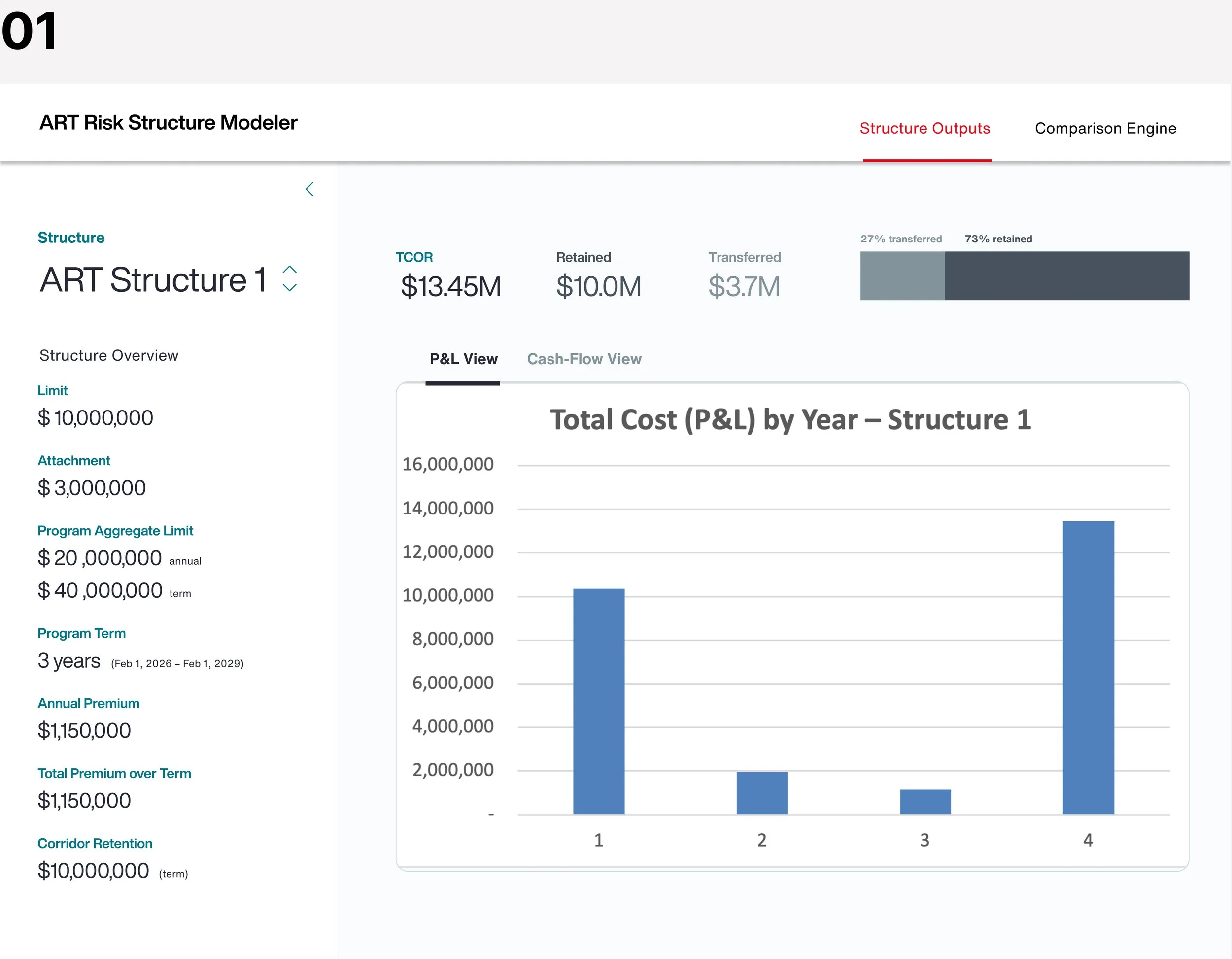
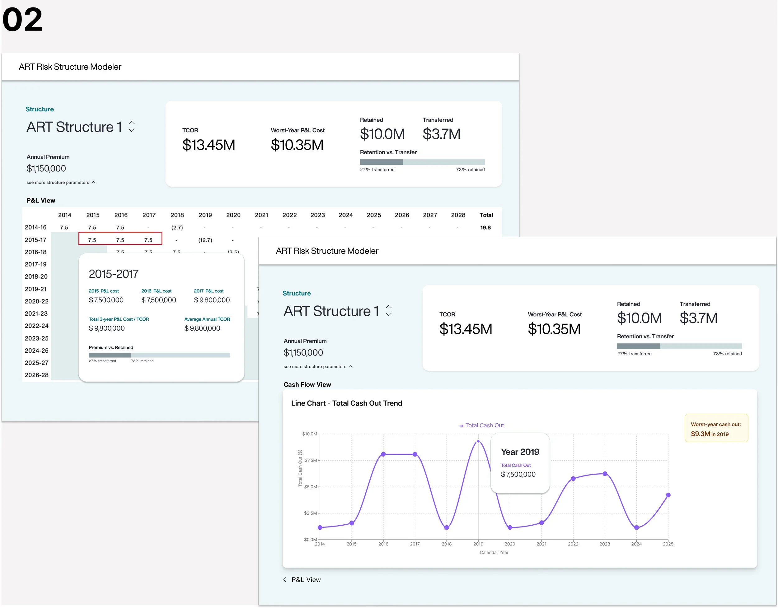
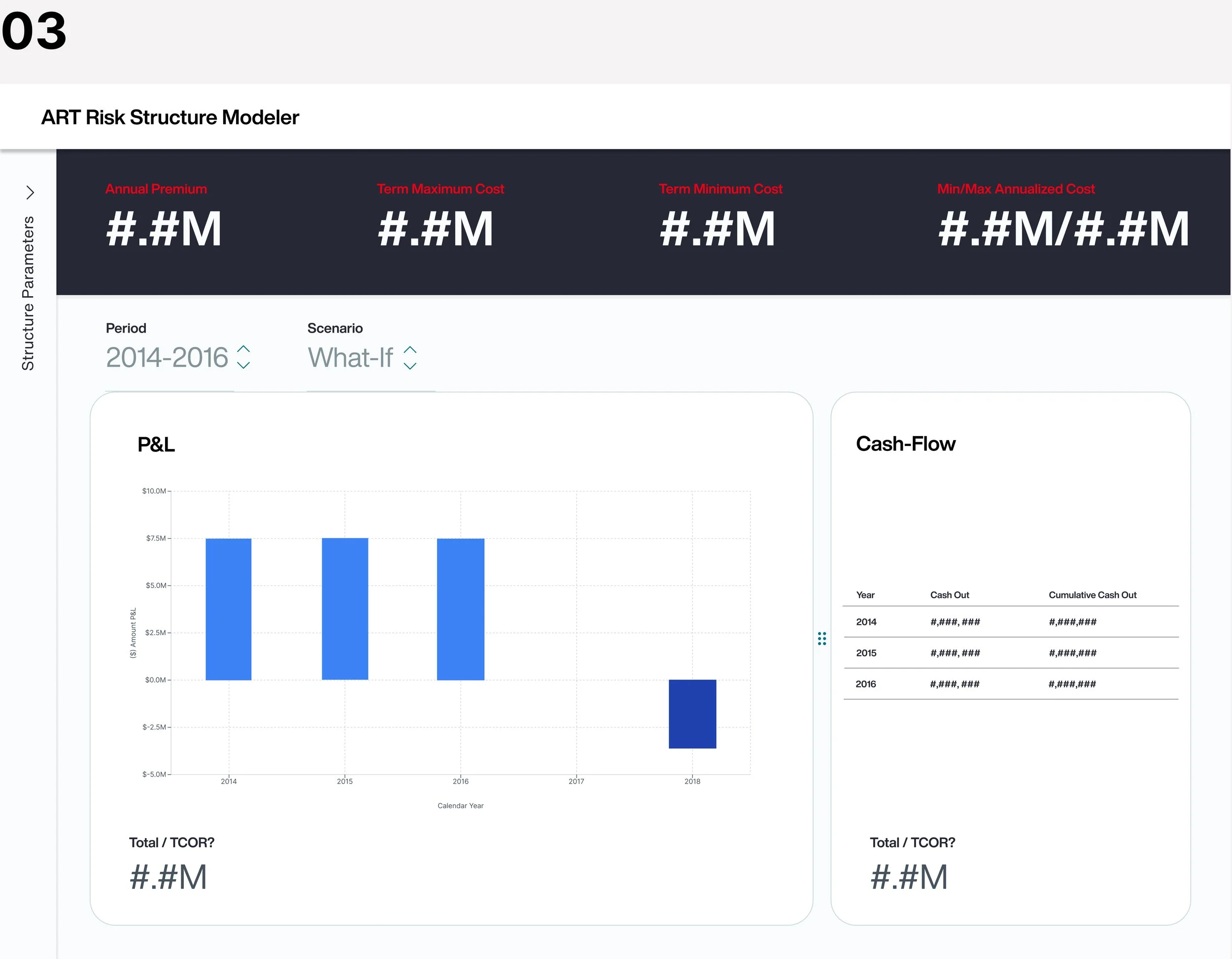
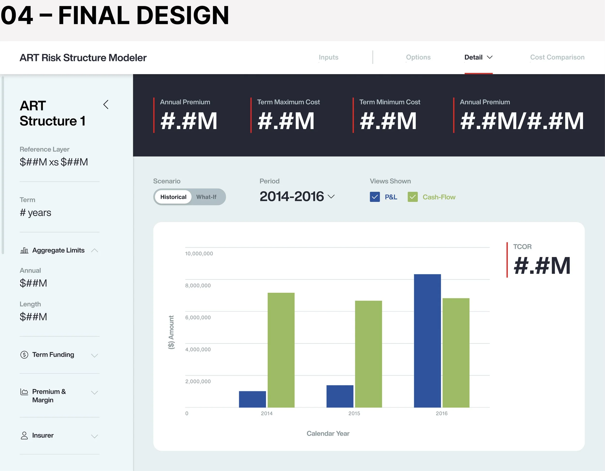
DETAIL PAGE ITERATIONS
PRECEDENT RESEARCH
Lastly, I conducted precedent research to study patterns in similar calculators and complex data tools
02 SYNTHESIS + DEFINITION
04 DESIGN REFINEMENT
DEV HAND-OFF
Coming Soon…
03 DESIGN + TESTING